

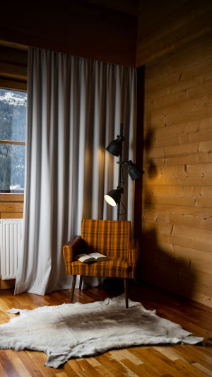
Hi, Readers! Light color temperature is one of those quiet design tricks that changes a room the way seasoning changes a meal.
You may not notice it right away, but the feeling lands fast. A warm glow can make a corner feel cozy and welcoming, while a cooler tone can sharpen a workspace and keep the mind alert.
That is why color temperature zoning matters. It lets different parts of the same home do different jobs without feeling like they are arguing with each other. Color temperature is usually measured in kelvins.
Lower values create warmer light that looks more golden or amber-like. Higher values create cooler light that feels crisper and more blue-tinted. In simple terms, warm light often sits around the lower end, neutral light lands in the middle, and cool light rises toward the higher end.
This is not just decoration fluff. It affects comfort, visibility, and even how materials and colors appear in a room.
<h3>What Color Temperature Does</h3>
Warm light tends to feel relaxing and intimate, making it a natural fit for places where people rest or gather. Living rooms, bedrooms, reading corners, and dining areas often benefit from this softer atmosphere.
It smooths the edges of the day, like a cozy blanket for the eyes. Cooler light, on the other hand, supports tasks that need attention and clarity. Kitchens, study areas, work desks, and utility spaces usually work better with a brighter, cleaner tone that helps details stand out.
Between these two sits neutral light, which can be very useful in transitional areas. Hallways, bathrooms, and general-purpose rooms often do well with a balanced tone that does not feel too sleepy or too clinical.
If warm light is a soft sweater and cool light is a crisp button-up shirt, neutral light is that dependable everyday tee that works almost anywhere.
<h3>How To Divide A Space</h3>
Color temperature zoning means assigning different light tones to different functions. In an open-plan home, this can be especially helpful. A dining corner can use warm lighting to encourage a relaxed mood, while a nearby desk or kitchen counter can use cooler lighting for visibility and concentration.
Instead of relying on one overhead fixture to do everything, it is better to layer the room with separate sources such as ceiling lights, table lamps, under-cabinet lighting, and wall fixtures.
This approach also helps large spaces feel more intentional. A room with one single light tone can feel flat, like toast with nothing on it. A room with thoughtfully zoned lighting feels richer and more flexible. The trick is to make transitions smooth.
Sharp jumps from very warm to very cool can feel jarring, so keeping neighboring zones reasonably close in tone usually creates a better flow.
<h3>Matching Light To Daily Life</h3>
The best lighting plan starts with what actually happens in the room. If a family spends evenings chatting, reading, or winding down, warmer lighting will likely carry most of the mood. If the room also needs to support paperwork, cooking, grooming, or hobbies that need precision, cooler task lighting can be added exactly where needed.
That way, the whole room does not need to feel like a bright office just because one corner has a job to do. Dimmers and adjustable lamps can make this even easier. They allow a space to shift mood across the day. Morning routines may feel better with brighter, cooler light, while evening hours often call for warmer tones.
This flexibility turns lighting into something dynamic rather than fixed, which is often the difference between a room that simply looks fine and one that feels genuinely good to live in.
<h3>Visual Comfort And Balance</h3>
Color temperature also changes how finishes, fabrics, and wall colors look. Wood tones often feel richer under warm lighting, while cooler lighting can make white surfaces appear cleaner and more energetic.
Because of this, the best choice is not only about function but also about what you want to highlight. A soft lamp near textured curtains can create a gentle glow, while cooler light over a counter can help make the area feel neat and practical. Still, balance matters.
If every corner uses a different tone without a clear purpose, the home can feel patchy. A good plan gives each zone a reason. Rest areas should calm the eye, task areas should support clarity, and shared spaces should connect the whole scene.
Think of it like arranging music in a room. Not every instrument plays the same note, but they should still belong to the same song.
In the end, color temperature zoning is really about helping each part of a room do its job while keeping the whole place comfortable and inviting. Start by noticing how you use each space, then match warm, neutral, or cool light to that purpose.
A few thoughtful changes can turn lighting from a basic necessity into the secret ingredient that makes home feel just right.